I hate to be the one to break it to you, but your concept of the world's layout is (probably) wrong. It's not your fault; you've just been misled all your life by the maps you see most often. There's an industry saying among mathematical modelers along the lines of “every model is wrong, but some are useful.†The same can actually be said for pretty much all maps. Take it from a geographer.
Before we get into maps, though, let's talk globes. Our planet is technically a “spheroid,†which is a fancy way of saying that it's almost, but not perfectly, ball-shaped. Obviously, there are the pointy bits that make up the mountain ranges and deep pits like the Mariana Trench. However, if we're talking the whole scope of the planet, these features just decorate the Earth's crust, which is only a measly 1% of the planet's mass. (Albeit a very important percent!)
What really throws off our perfect-sphere is the Earth's rotation on its axis. As our planet spins, it creates centrifugal force–the same force that sticks your clothes to the sides of the washing machine in its final spin cycle. Centrifugal force causes Earth to bulge around the equator and flatten a bit at the North and South Poles. This is not what globes portray, but hey, who wants a lumpy, squashed spheroid on their shelf anyway, right?
Our standard globes are simplified, generalized models of reality that work just fine to give us an idea of where we live in relation to each other. It's not quite right, but it's not horribly wrong either, because you're working with two very similar shapes.
A map, however, is a 2D representation of a 3D object, which inherently presents some trickier problems. Take a piece of paper and attempt to wrap it around any sphere-like object. You will find it impossible to do without crumpling some paper. Similarly, if you were to magically extract the surface of a globe onto that wrapped paper, all those crumpled areas get stretched out and distorted. If you're trying to wrap paper around the globe with the least amount of crumple, your best options a re to wrap it around the sphere in a hollow tube, or cylinder; to turn it into a cone, like a little globe hat; or to hold the paper flat against the globe in any one area.

These three strategies are actually the basis behind most of the maps you see, with varying degrees of “crumple†(i.e. distortion). This process of transforming a 3D globe into a 2D map is called a map projection. While there are scores of possible map projections, each of them is most accurate in the space where the 2D plane (our paper) directly contacts the 3D model of Earth (our hypothetical sphere); the choice of which to use depends on which part of the Earth you want to see most accurately. Because of the issues inherent in transformation, every map is distorted in one or more of the following ways: distance, direction, shape or area.
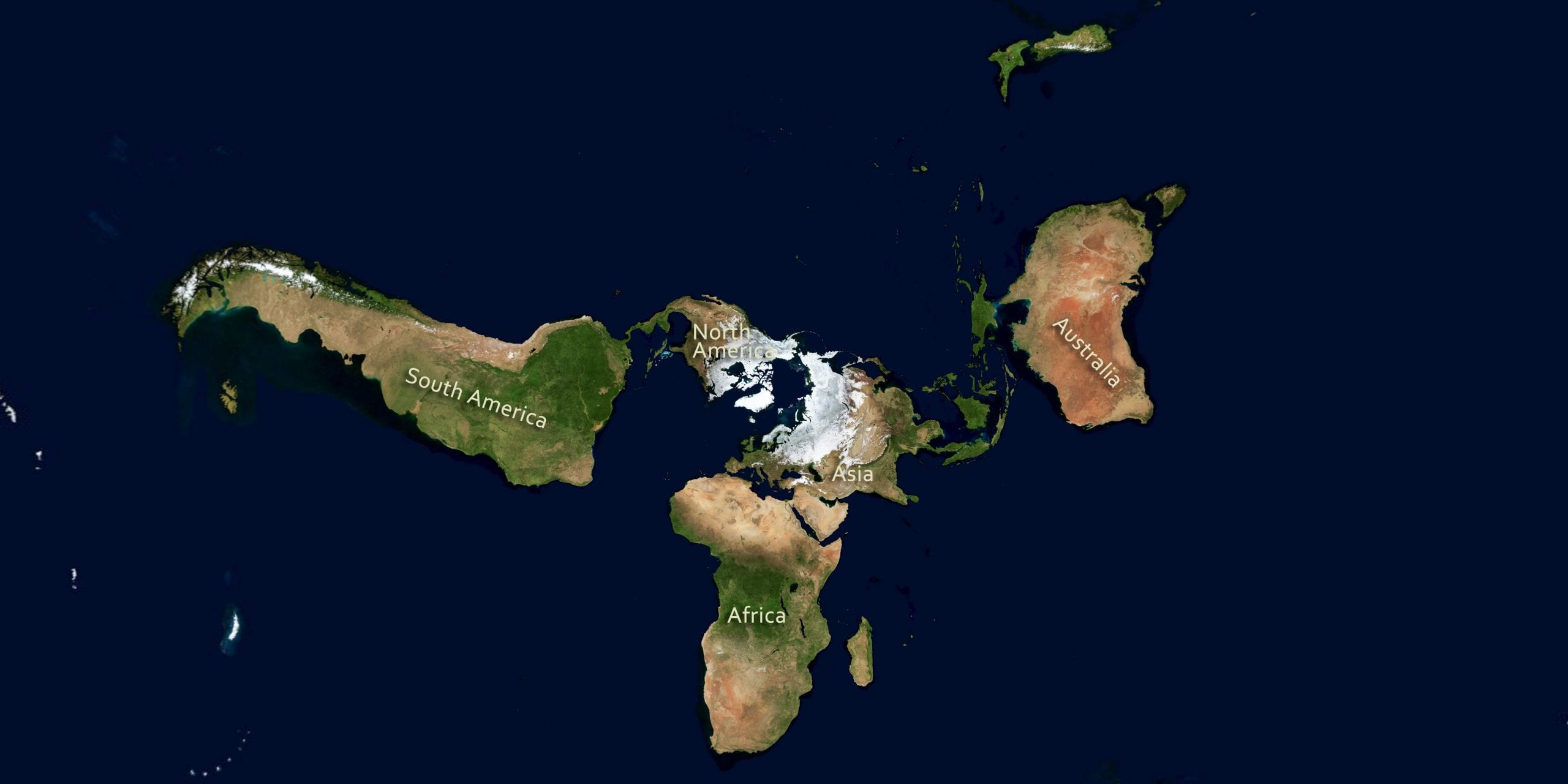
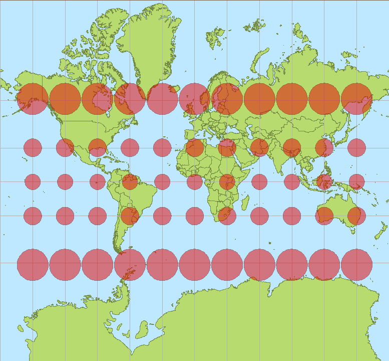
Consider, for example, the Mercator projection. This is what has been lying to you all your life. Although you probably don't recognize it by name, believe me when I tell you that you're familiar with it's shape. It's the preferred map projection for web application backgrounds (zoom out your GPS or weather map) and many classrooms. The Mercator projection is recognizable by the telltale stretching of features at the poles, which dramatically distorts the size and shape of many countries, and even entire continents. (Hint: Greenland is not actually the same size as Africa; it's about 3x the size of Texas.) The Mercator's original purpose was for seafaring, and it prioritizes accurate direction and distance, at the expense of area and true shape. Compare it here to other ways of mapping the globe.
Maps influence our understanding of the world, and even our relative importance within it, which is why projections are so important. Good cartographers (your friendly neighborhood mapmakers) chose a projection that depicts their region of interest with little distortion–but even these aren't totally true, in a white lie kind of way. So next time you come across a map, consider it critically, and take it with a grain of salt. And when in doubt, consult your globe!
Cover Image Credit: Greg Robbins via Flikr
 Caitlin Mertzlufft is an Athens native, and a PhD candidate in the Integrative Conservation &Geography program at UGA. Caitlin’s research combines geospatial analysis and public health, and she is currently using satellite imagery to estimate Chagas disease transmission in central Panama. When she’s not looking at palm trees from space, she enjoys running, nerdy board games, and all things coffee. Follow her on twitter @CaitlinMertz or send her an email at cmertz2@uga.edu. More from Caitlin Mertzlufft.
About the Author
- athenssciencecafehttps://athensscienceobserver.com/author/athenssciencecafe/April 17, 2020
- athenssciencecafehttps://athensscienceobserver.com/author/athenssciencecafe/April 12, 2020
- athenssciencecafehttps://athensscienceobserver.com/author/athenssciencecafe/April 3, 2020
- athenssciencecafehttps://athensscienceobserver.com/author/athenssciencecafe/March 30, 2020

